Coursebox Homepage Redesign
A 5-week homepage redesign for an AI course creation platform — from static feature list to interactive product experience.
Timeline
Apr 8, 2026 – May 15, 2026 (5 weeks)
Team
Lead Designer: Joe Designer: Me
MY RoLE
Defined the information architecture for both Homepage and AI Video Page.
Led UI design for the Homepage from section specs to Figma handoff.
Built 5 HTML prototypes to communicate in-page feature demonstrations.
Designed responsive layouts for both pages.

Overview
Coursebox is an AI-powered platform for building professional online courses — with a full training ecosystem: AI LMS, white-label distribution, SCORM, and AI learning tools.
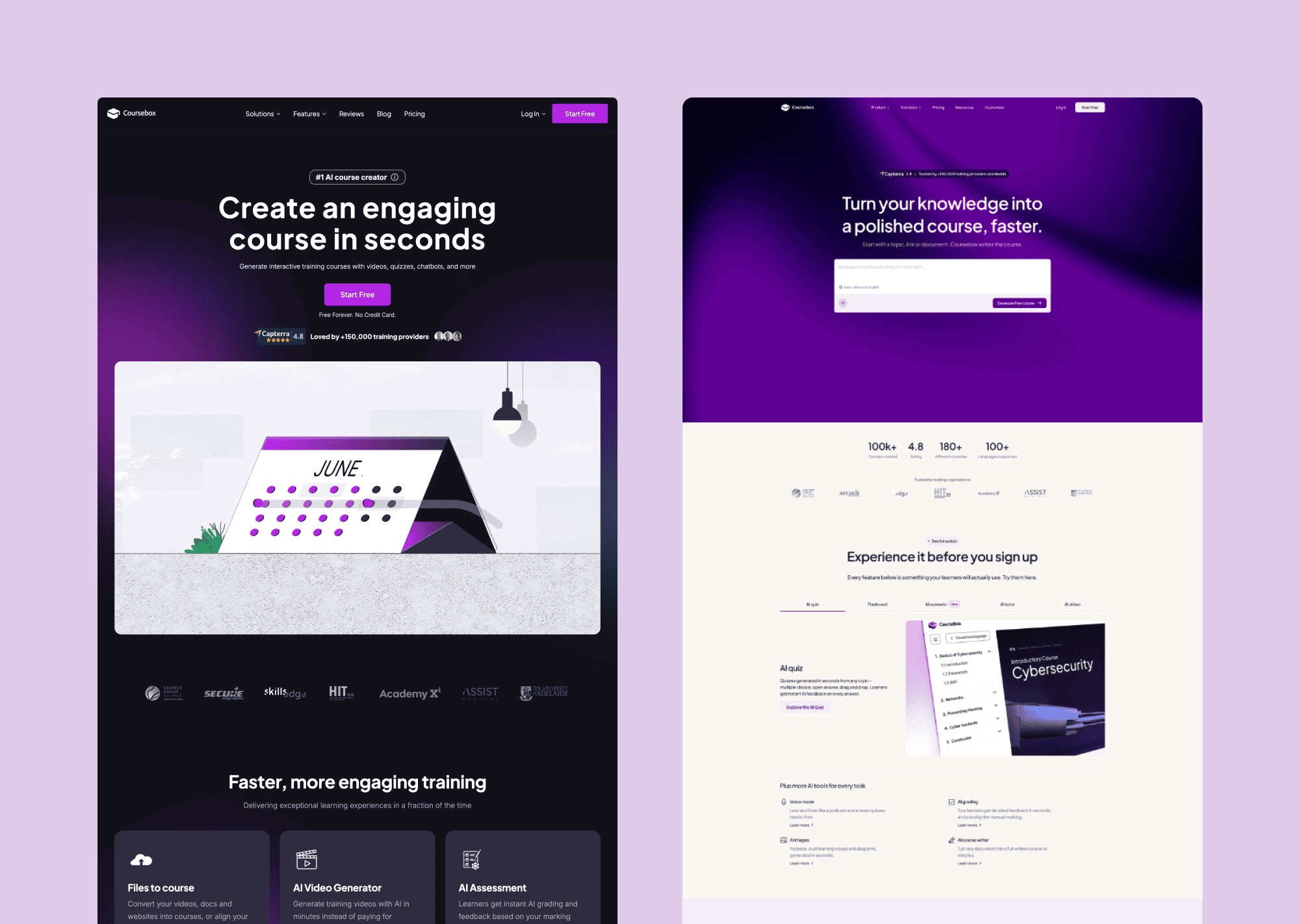
The existing homepage listed features but never demonstrated them. There was no moment where a visitor could feel the product.
Before / After
Challenge
The existing homepage had three compounding problems.
A homepage audit mapped the full visitor journey and identified where trust broke down at each stage:
No felt value in the first five seconds. The hero led with copy, not experience. Visitors had to imagine what the product did rather than feeling it immediately.
No proof the output was real. Features were described but never demonstrated. Visitors left without a clear picture of what a finished Coursebox course actually looked like — or felt like — for a learner.
SEO-driven content overload. The page had been packed with text to serve search engines — leaving visitors with a wall of information and no clear message to hold onto.
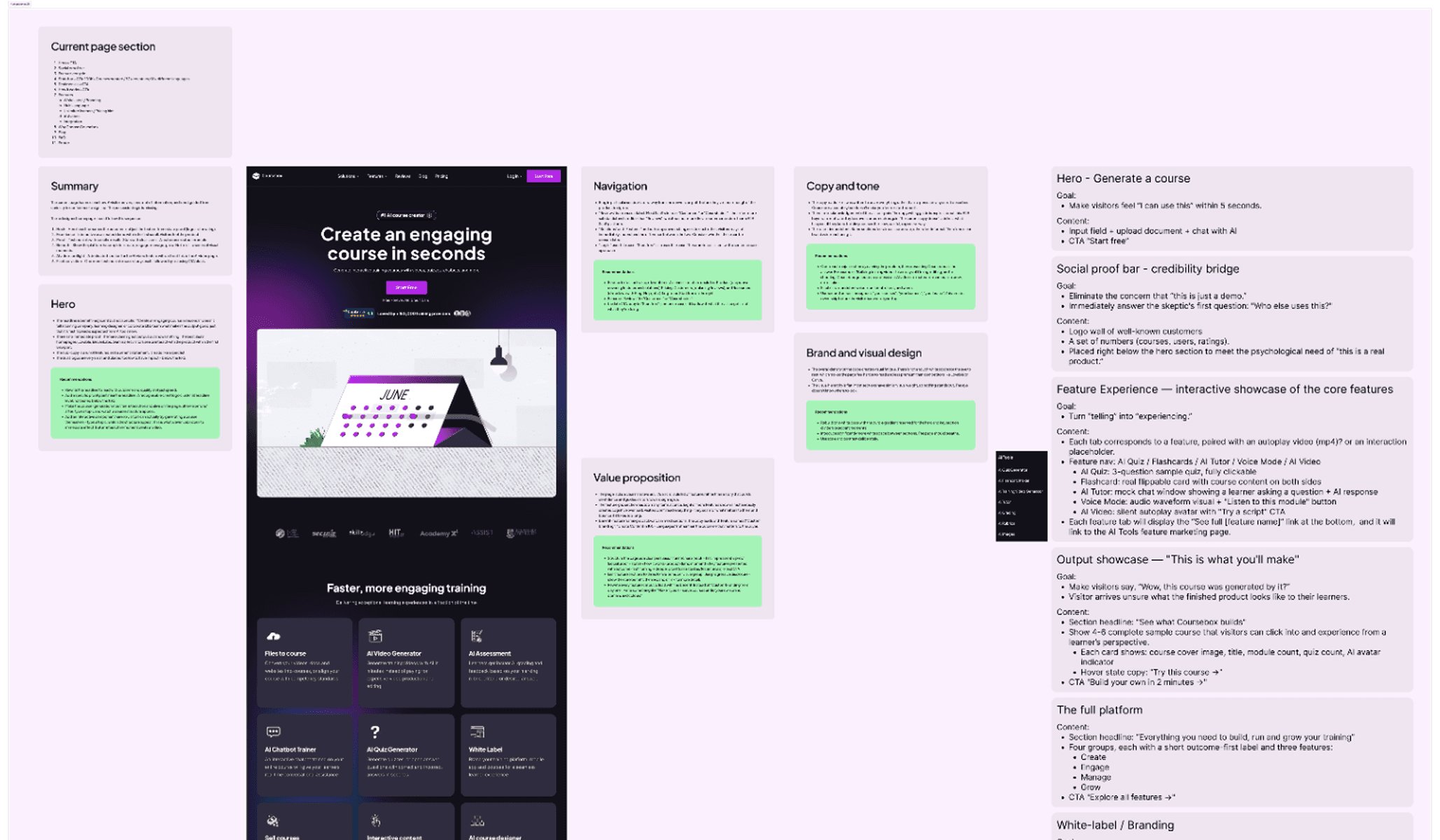
Caption: The existing homepage annotated against visitor goals — each section evaluated for what it needed to do, not just what it contained. The revised IA on the right defined the new page structure before any visual work began.
Discovery
Four feedback rounds. One principle that held across every decision.
The project ran on a structured loop: brief analysis → IA architecture → section-by-section specs → HTML interactive prototypes → client review. Four rounds of feedback produced a large number of revision requests — but only one principle drove every acceptance or rejection:
Every section must demonstrate the product — not describe it. If a visitor can read the headline and move on without feeling anything, the section hasn't done its job.
Competitive analysis of leading AI and product-led SaaS experiences revealed three consistent patterns: heroes that function as product entry points, features demonstrated through interaction, and visual variation between sections doing active trust-building work. All three became structural requirements for the redesign.
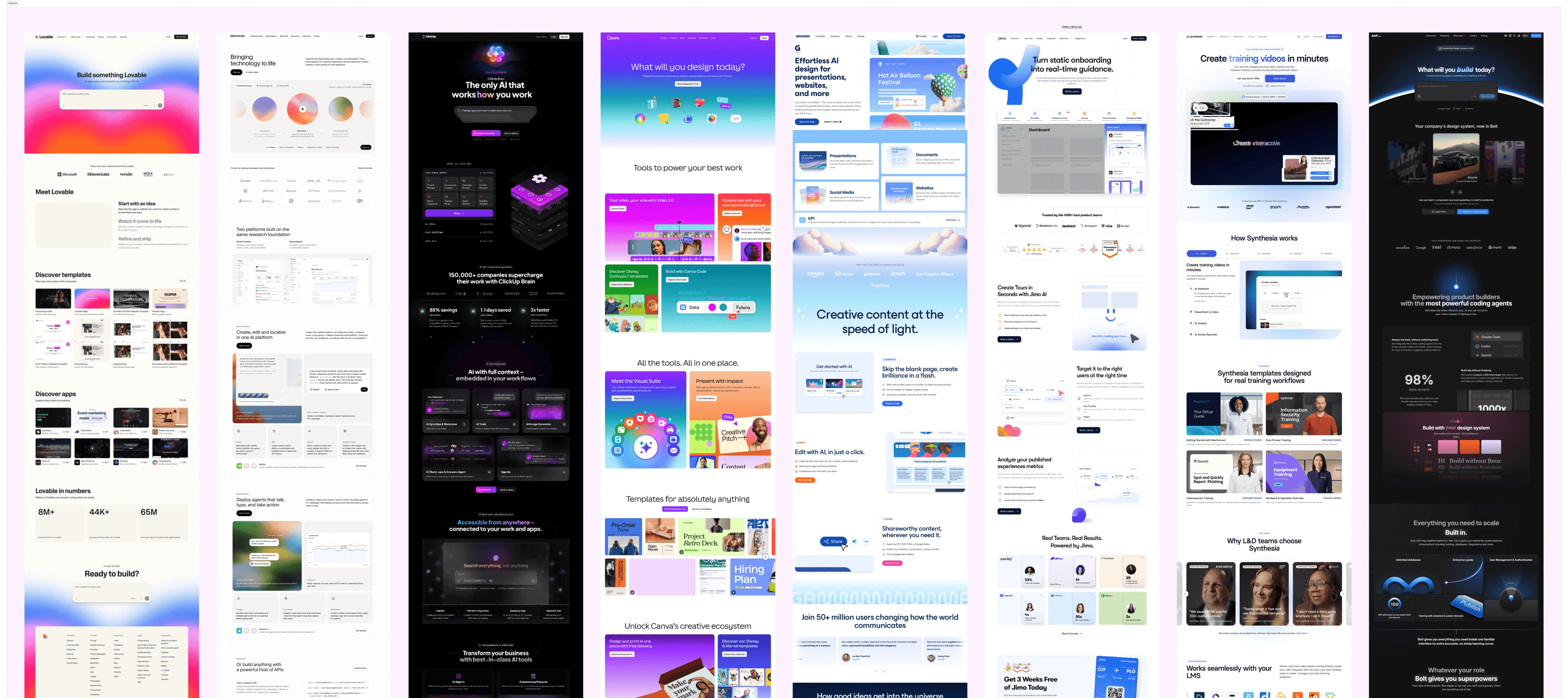
Caption: Competitive Analysis Board — annotated screenshots showing the three identified patterns.
The insight that shaped the IA.
"People don't want a quarter-inch drill. They want a quarter-inch hole."
— Theodore LevittMost products still lead with the drill.
The Coursebox homepage was no different — every section organised around features the platform has, not outcomes the visitor is trying to reach. The structural fix wasn't visual. It was a reframe of what each section was actually for.
Two IA decisions came directly from this. The Output Showcase let visitors see a finished course as a learner would — shifting the internal question from "can this make something good?" to "I want to make something like that." The Feature Interactive section collapsed five separate tabs into one sequential flow — Avatar → Script → Voice → Output — so the visitor experiences a complete outcome, not a product inventory.
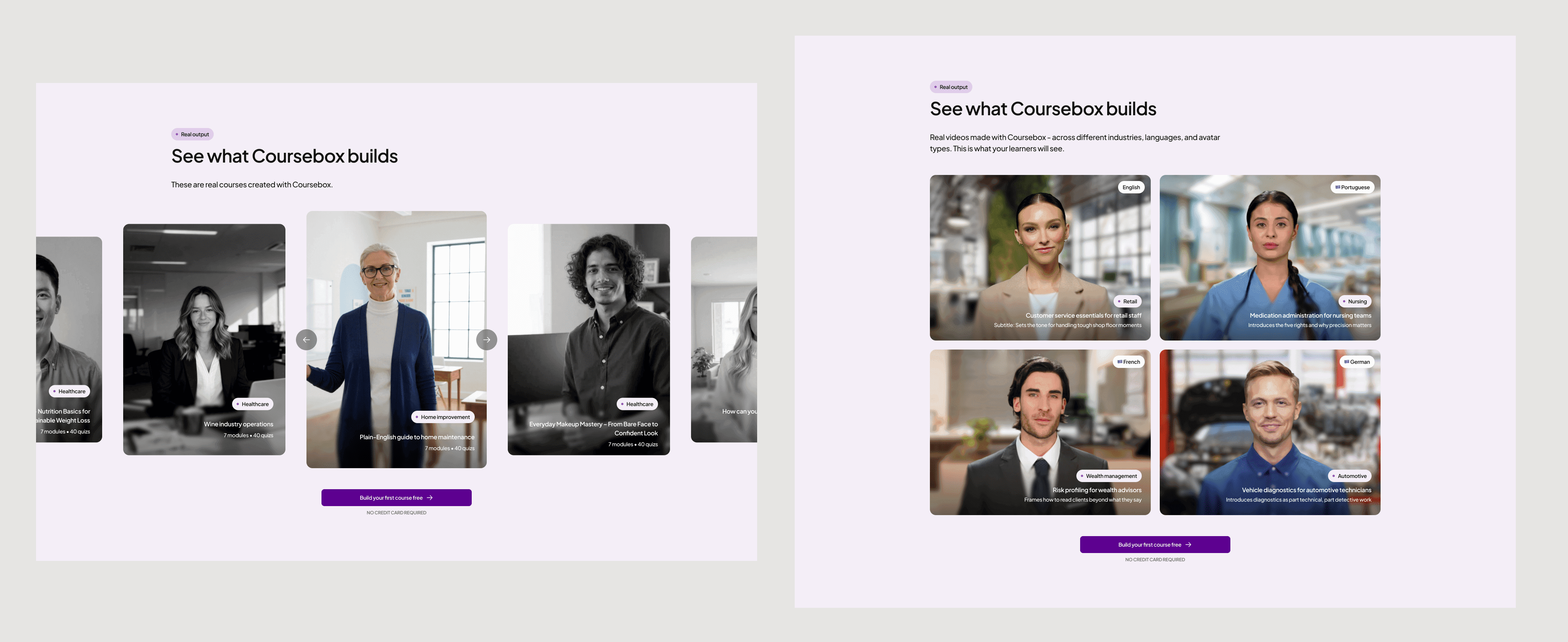
Caption: Two output showcases, one principle — show the finished product before asking for a signup.
Solution
Stop telling visitors what the product does. Show them what they'll make.
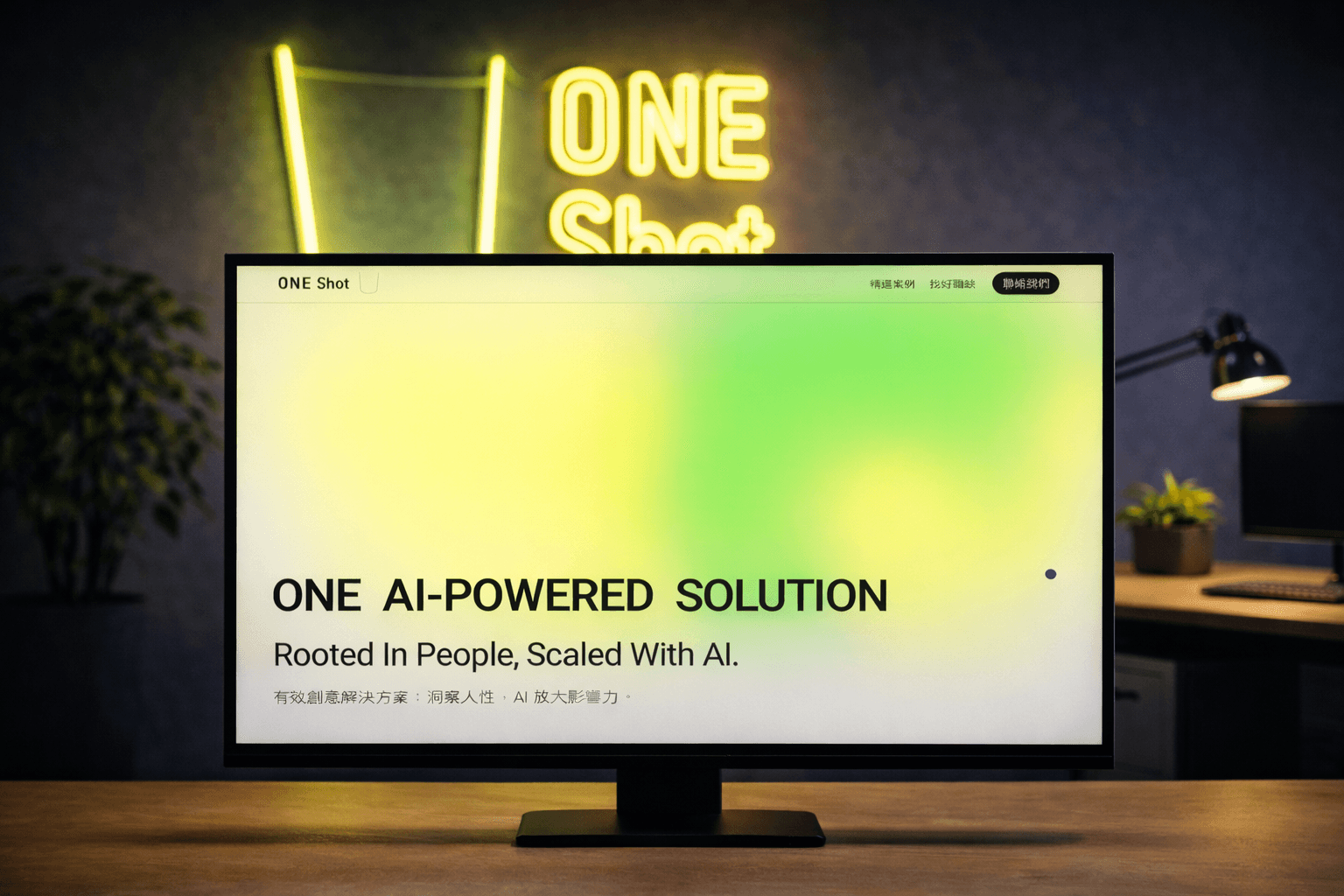
1. Hero: The homepage opens inside the product — a prompt input at the centre of a dark gradient. The visitor's first action on the page mirrors their first action inside the platform.
2. Full Platform: Five animated cards, each with its own motion logic. Platform connectivity communicated without a word of copy.
3. White-Label: The "after" state was designed as a structurally different product — not a colour swap. The visitor's intuition becomes "I built this," not "I changed the colours."
4. Experience It: A tabbed interactive preview lets visitors sample actual output quality before signing up. Not a navigation choice — a trust mechanism.
Impact
5.5 weeks. 4 feedback rounds. 5 HTML prototypes built to communicate interaction intent — not just visual design. The clearest measure of delivery quality: the developer started building within 24 hours of receiving the Figma file. No revision cycle. No clarification calls. A file specific enough to build from directly — that's the standard.