AI Ambassador Kiosk
Led end-to-end kiosk UX for an AI ambassador — improved accessibility, added voice feedback, and reduced user confusion for non-tech-savvy visitors.
Timeline
2025 - 1 week
Team
Product Designer: Me Developer: CEO
MY RoLE
Led the end-to-end prosuct design process
Planned information architecture and interaction flows
Designed accessible, high-clarity UI based on WAI/Nielsen guidelines
Communicated solutions with the CEO
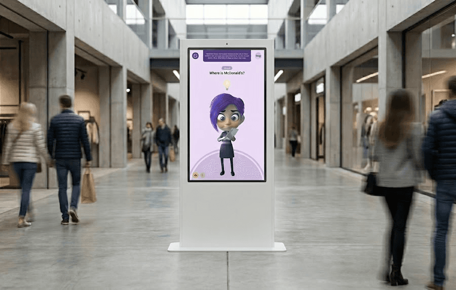
Overview
AI Ambassador is an AI-powered kiosk designed to improve visitor experience in large public spaces such as shopping centers. It helps users navigate the environment, discover promotions, and access key services through intuitive voice and motion interactions.
After launching the MVP and receiving positive client feedback, we refined the product to improve accessibility, engagement, and overall human–machine interaction. The enhanced experience made the kiosk more inclusive, increased user adoption, and strengthened client trust, opening opportunities for further collaboration and new business.
Challenge
While the first MVP received positive feedback, we noticed a few issues that disrupted the user experience.
Limited Accessibility – The initial design didn’t fully support users with disabilities, making navigation difficult.
Complex Interactions – Some users found the kiosk confusing, especially those unfamiliar with technology.
Tight Deadline – I had only one week to research, design, and refine the solution.
Discovery
With limited access to direct users and post-launch data, discovery focused on reducing product risk by identifying the most critical barriers to kiosk adoption in public spaces. Rather than expanding feature scope, the goal was to determine which interaction and accessibility issues would most impact first-time usage and inclusivity.
Key Observations
Through on-site observation, client-shared feedback, accessibility best practices, and competitor patterns, three recurring risks emerged:
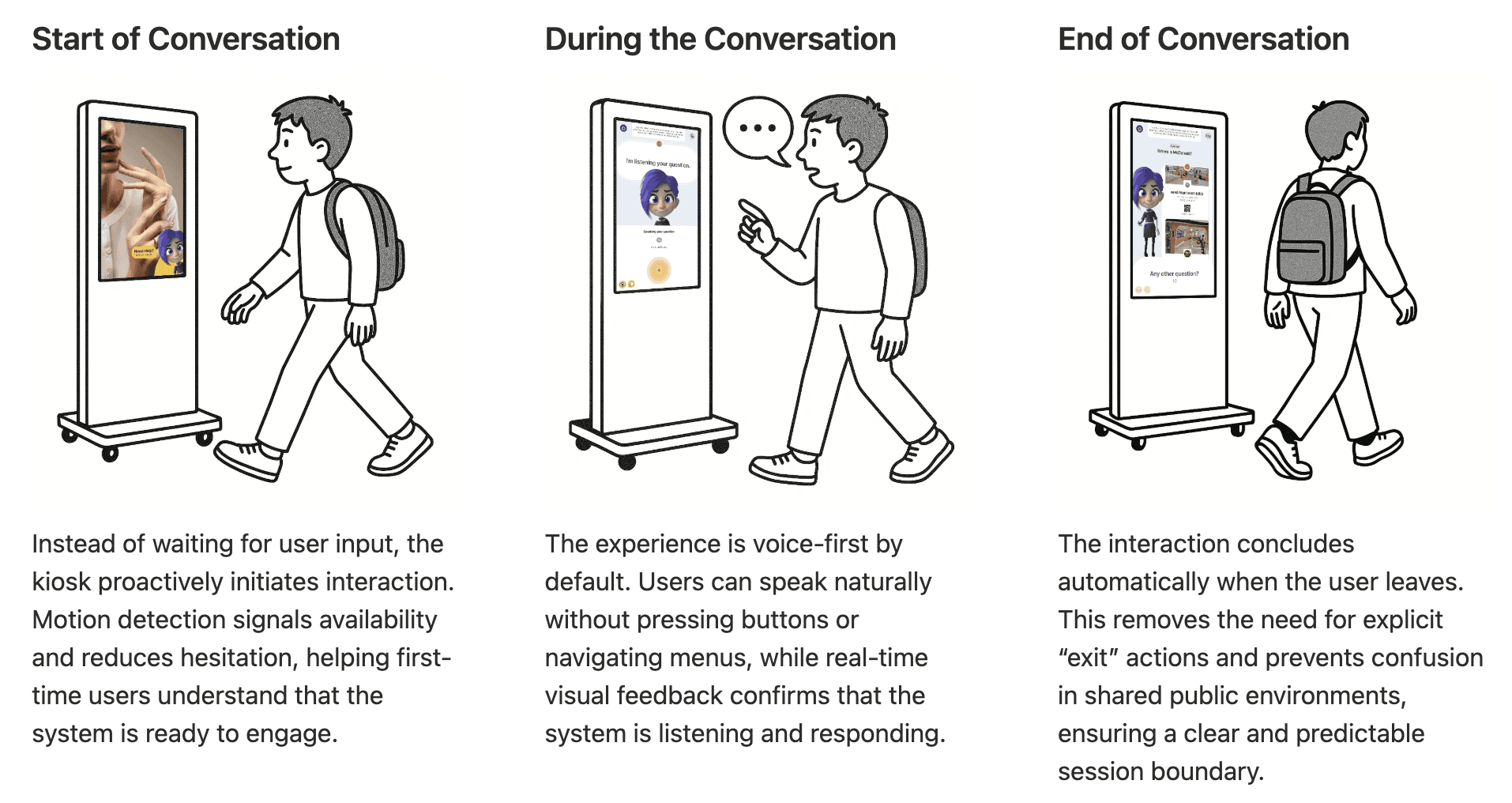
Users often hesitated to initiate interaction without a clear system prompt
Complex or text-heavy interfaces increased cognitive load, particularly for elderly users
Voice-only interaction excluded users with speech or physical limitations

Design Direction
Based on these risks, the design prioritized lowering the interaction threshold and reducing cognitive effort. Motion-triggered greetings and voice activation were used to invite engagement, while a clear 3-step flow, simplified language, and high-contrast visuals improved usability across diverse user groups.
Prioritization Rationale
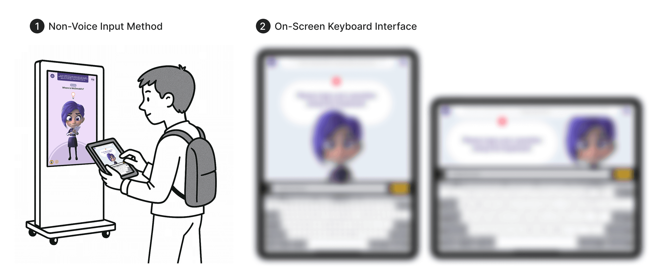
Given MVP constraints, design efforts focused on changes with the highest accessibility impact and lowest implementation risk. Voice and motion-based interaction were prioritized to enable hands-free use, while alternative input methods were identified as a future opportunity once technical and resource constraints allow.
Solution
Just like talking to a human
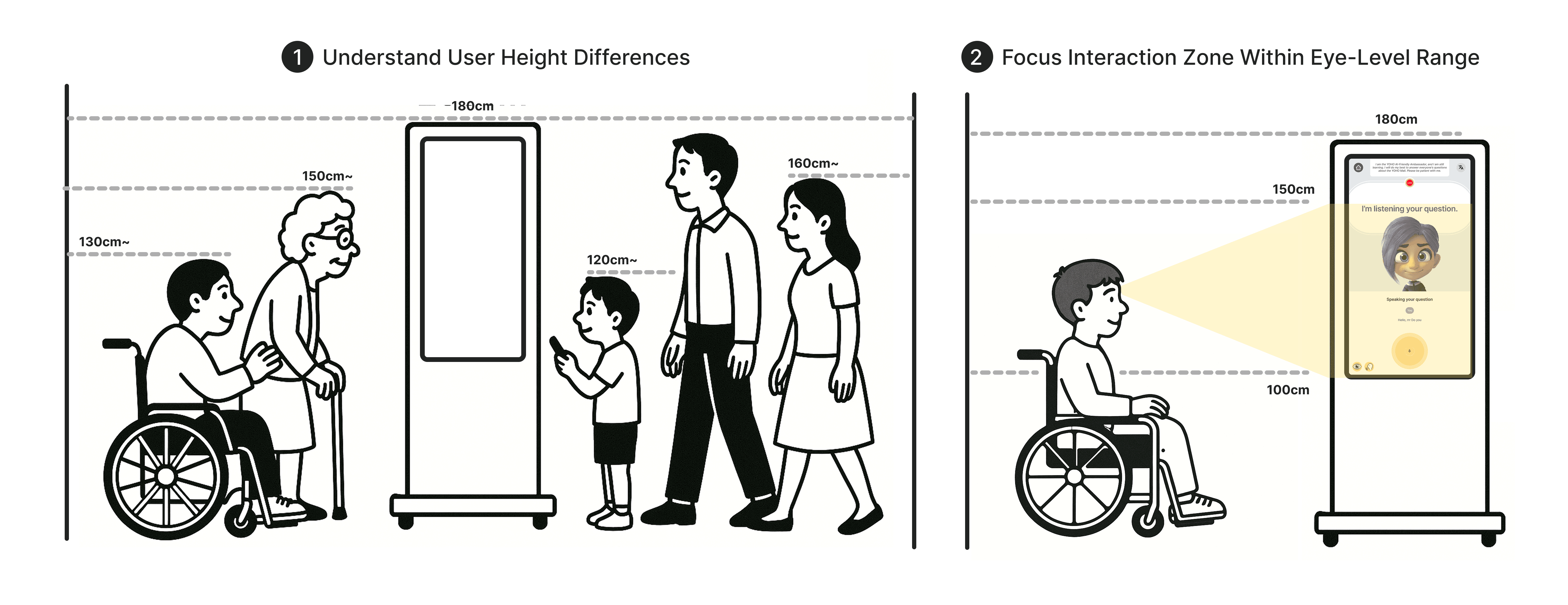
Adapting the Interface for All Eye Levels
Essential interface elements were positioned within the 120–150 cm viewing range to support seated and wheelchair users. This accessibility-first decision enables comfortable, independent interaction without physical strain or assistance.
Clear Feedback. Confident Users.
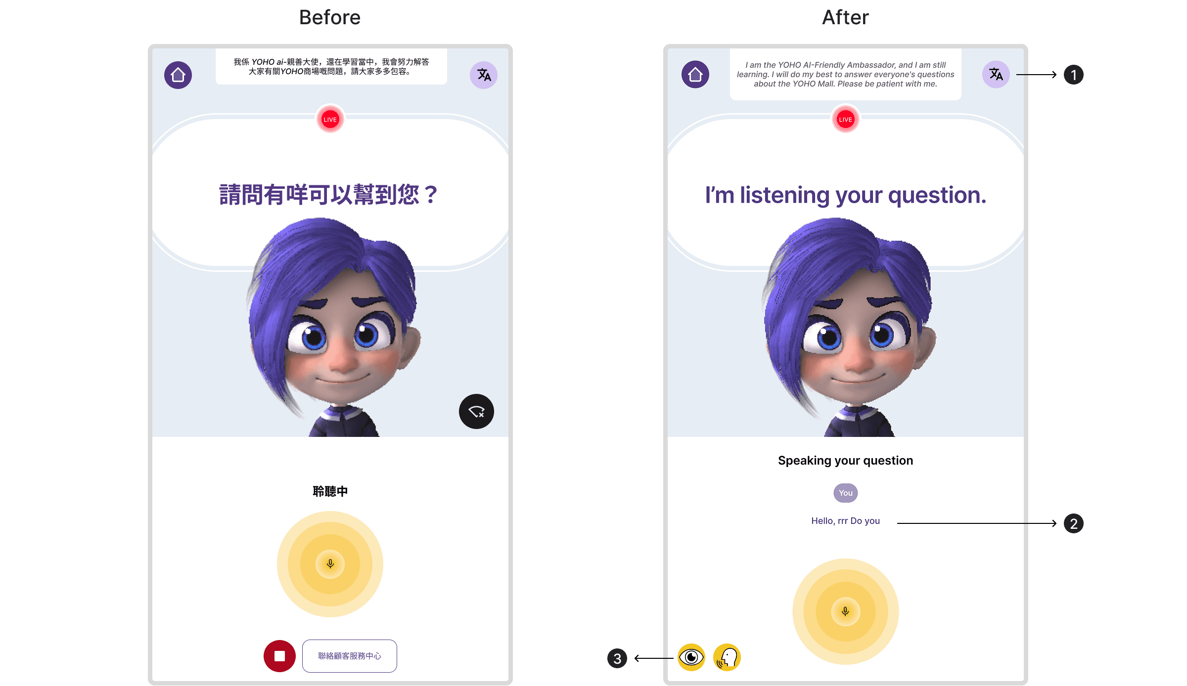
Easy Language Switching
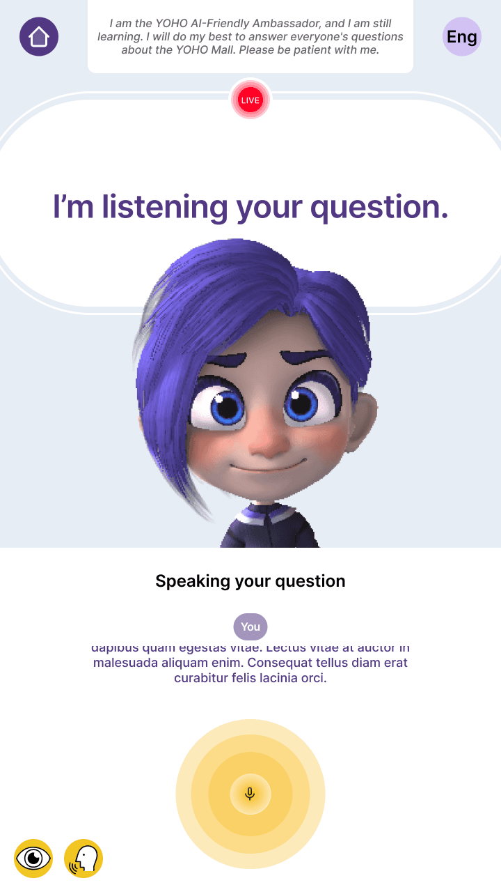
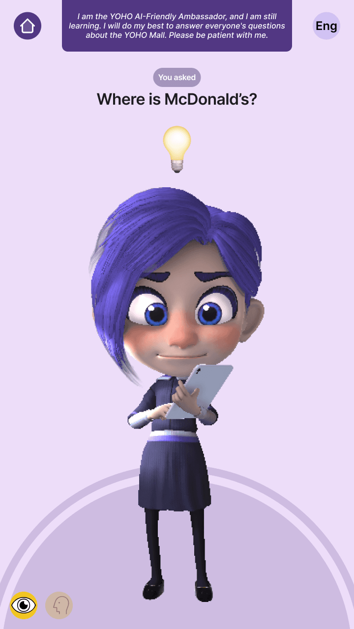
The original interface lacked clear listening feedback. Adding eye and voice icons helps users know the AI sees and hears them, reducing uncertainty.Real-time Transcript Display
Users couldn’t confirm what the AI heard. Showing a live transcript improves clarity and builds trust in the voice interaction.Visual Feedback for AI Listening
The original interface lacked clear listening feedback. Adding eye and voice icons helps users know the AI sees and hears them, reducing uncertainty.
One Glance, One Action
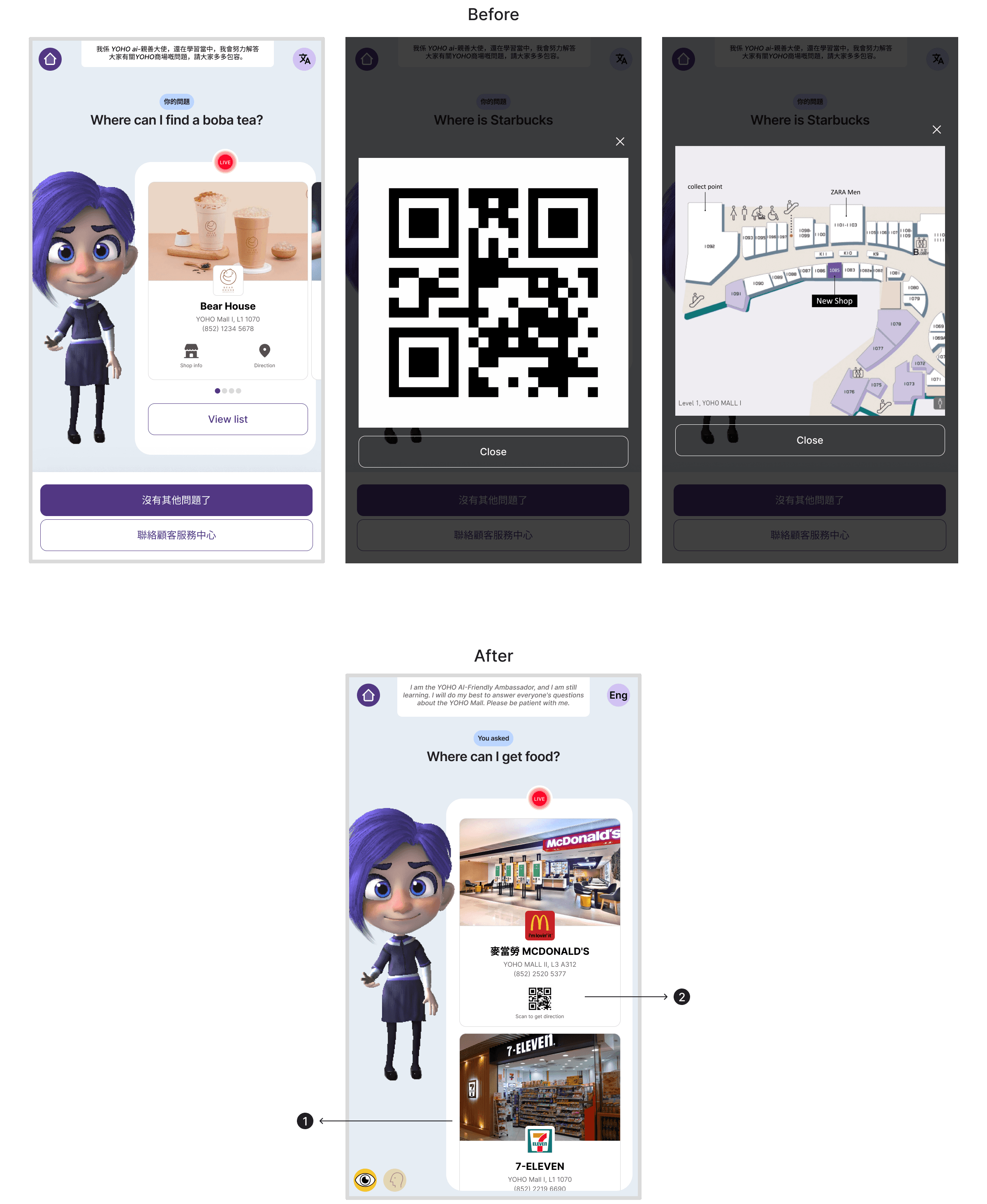
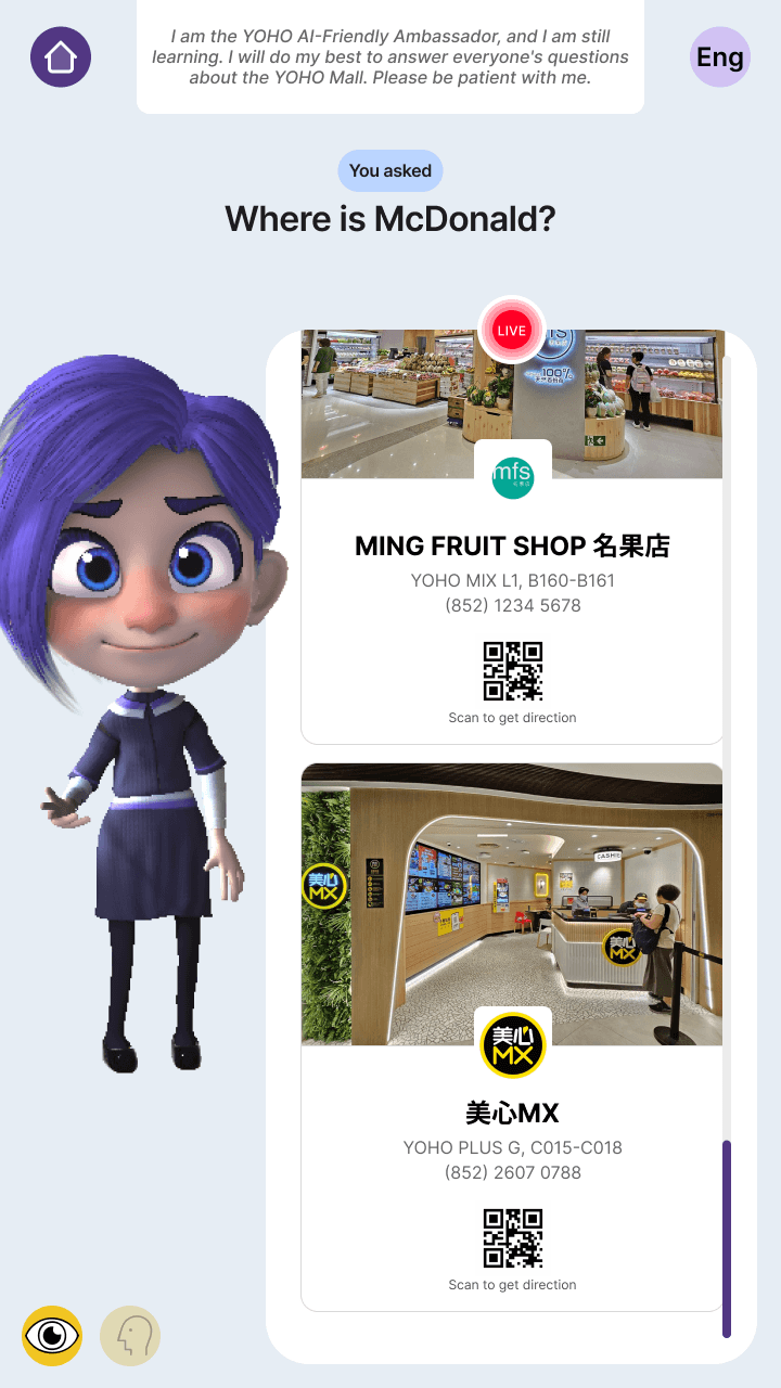
Redesigned Card Scroll Direction
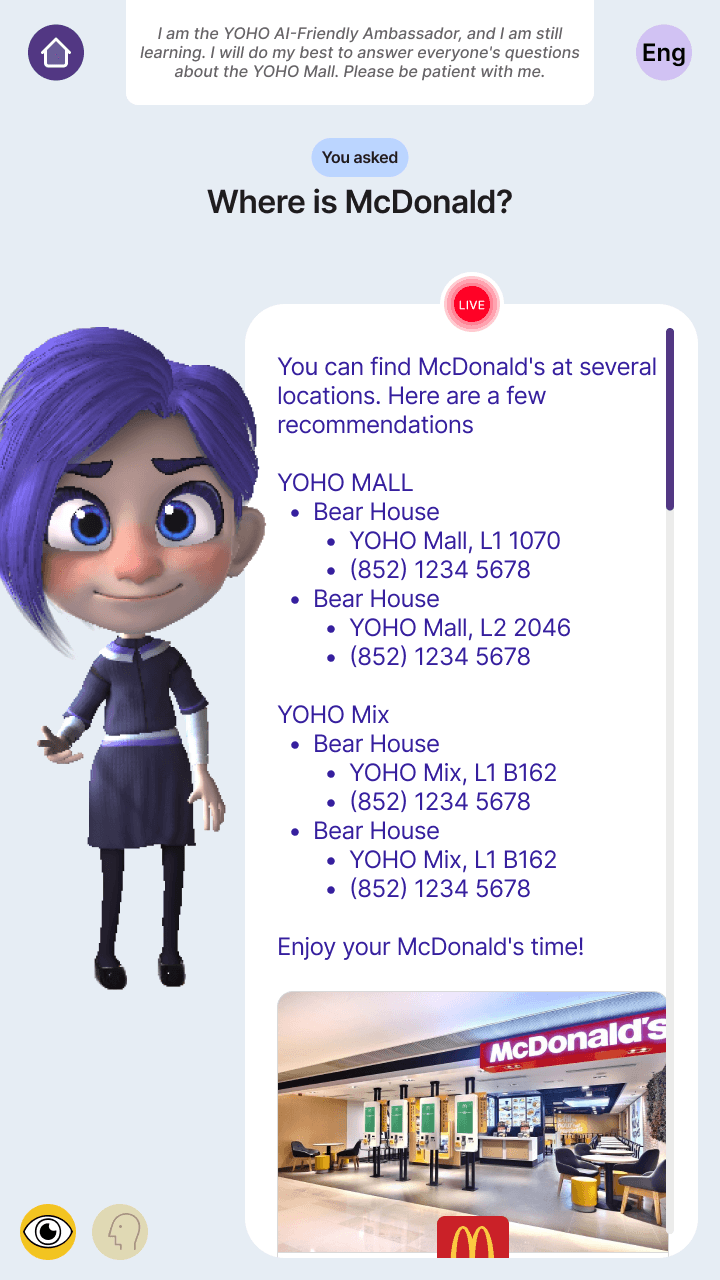
The original horizontal scroll made it hard to notice the next card due to limited visibility. Switching to vertical scroll not only reveals more of the next card, but also aligns with modern mobile users’ natural habit of scrolling downward, resulting in a more intuitive and seamless experience.Redesigned Store Info Card
Users can instantly see store details and navigation without extra clicks, making the experience faster and smoother.
Simplified Exit Flow for Clarity and Ease
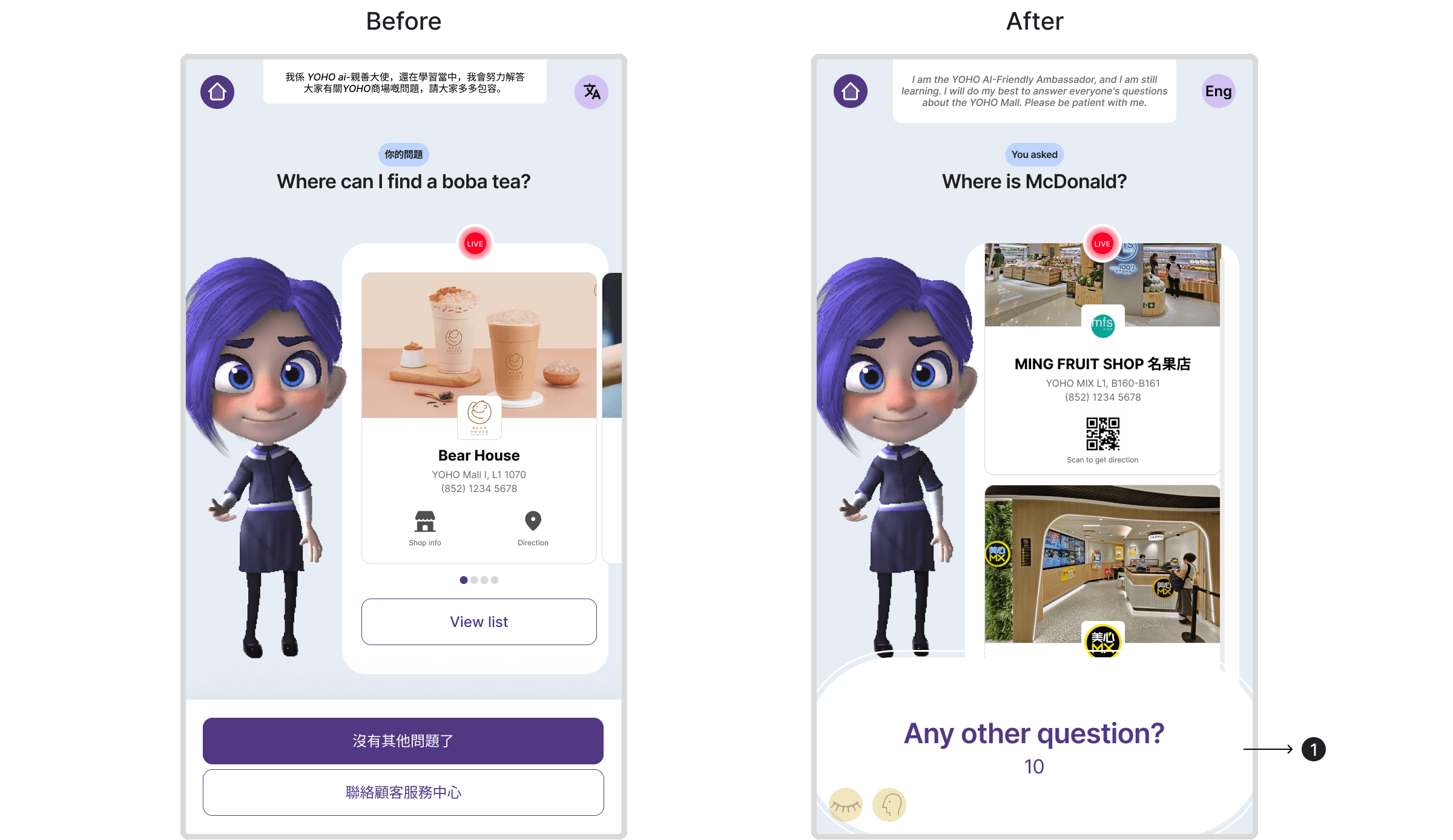
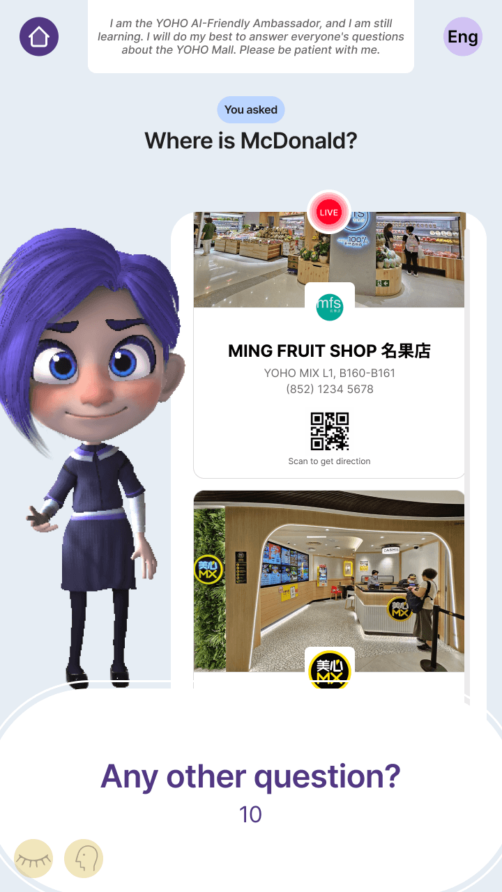
Countdown Timer for Session Closure
The original design used two buttons to end or seek help, but this only worked well for some users.
The new design replaces them with a countdown prompt, making the experience simpler, clearer, and more natural for everyone.
Impact
The kiosk delivered a clear, accessible, voice-first experience that increased engagement and reduced confusion, earning positive feedback from both the client and internal team. This project demonstrated my ability to design inclusive solutions under tight timelines and limited research access.
Next Steps
Validate accessibility decisions through targeted usability testing, analyze interaction data, and expand non-verbal input options.